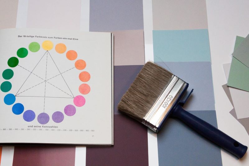
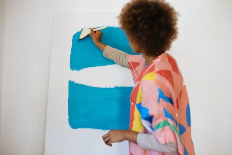
The Psychology of Color: Choosing the Perfect Paint for Your Interiors
When it comes to interior design, few elements wield as much influence as the colors we choose to adorn our living spaces. Colors have the remarkable ability to evoke emotions, shape perceptions, and set the tone for our experiences within a room. Understanding the psychology of color empowers us to create environments that not only reflect our tastes but also resonate with the intended mood and atmosphere. In this comprehensive guide, we’ll explore the intricate interplay between color and psychology, offering insights and practical tips to help you navigate the exciting world of interior paint selection.
The Power of Warm Tones
Warm colors, with their vibrant hues, possess the innate ability to infuse a space with energy, vitality, and a welcoming ambiance. Reds, oranges, and yellows, the cornerstone of warm tones, evoke feelings of warmth, passion, and optimism. When applied judiciously, these colors can transform a room into a hub of social interaction and conviviality. Picture a cozy living room bathed in the warm glow of a fiery red accent wall, inviting guests to linger and engage in spirited conversations late into the evening. However, it’s important to exercise restraint when incorporating warm tones, especially in smaller spaces, as overly intense hues can overwhelm the senses and make the room feel visually constricted. Be sure to consult with a professional interior painter to strike the perfect balance between warmth and visual harmony. Even if you’re a DIY enthusiast, it’s always a good idea to seek guidance from experts who can provide valuable insights and recommendations based on your specific needs and preferences.
Cool Shades for Tranquility
In stark contrast to the fiery intensity of warm tones, cool shades exude a sense of calm, tranquility, and serenity. Blues, greens, and purples, the stalwarts of cool colors, draw inspiration from nature’s most soothing elements—the vast expanse of the sky, the tranquil depths of the ocean, and the verdant splendor of lush forests. A bedroom adorned in soft shades of blue conjures images of cloudless skies and gentle breezes, lulling its occupants into a restful slumber. Similarly, a bathroom bathed in the cool embrace of seafoam green evokes feelings of rejuvenation and renewal, transforming the daily ritual of bathing into a transcendent experience. Cool tones offer a refuge from the hustle and bustle of modern life, providing a sanctuary where the mind can unwind and the spirit can soar.
The Neutral Palette’s Timeless Elegance
In the realm of interior design, neutrality reigns supreme, offering a timeless canvas upon which to unleash one’s creative vision. Whites, grays, and beiges, the epitome of understated sophistication, serve as the backbone of the neutral palette, imparting a sense of purity, balance, and understated elegance to any space. A living room swathed in crisp white walls exudes an air of effortless chic, serving as the perfect backdrop for bold, eclectic furnishings and avant-garde artwork. Likewise, a kitchen adorned in soft shades of gray strikes the perfect balance between modern minimalism and rustic charm, fostering an atmosphere of culinary creativity and conviviality. Neutrals possess the unique ability to adapt to a myriad of design styles and sensibilities, making them an indispensable tool in the discerning decorator’s arsenal.
The Bold Impact of Accent Colors
While neutrals lay the foundation, accent colors inject personality, drama, and visual interest into a room, transforming the ordinary into the extraordinary. Whether it’s a sultry burgundy accent wall or a daring emerald green sofa, bold hues demand attention and command respect, serving as focal points around which the rest of the room revolves. An accent color isn’t merely a decorative flourish; it’s a statement of intent—a bold declaration of one’s unique tastes, preferences, and sensibilities. A carefully chosen accent color has the power to elevate the mundane to the sublime, imbuing a space with a sense of drama, dynamism, and undeniable allure. When selecting an accent color, dare to be bold, dare to be different, and watch as your living spaces come alive with personality and panache.
Earthy Tones for Grounding Spaces
In a world marked by constant flux and upheaval, there’s something undeniably reassuring about the earthy embrace of browns, terracottas, and muted greens. These natural hues evoke a sense of rootedness, stability, and connection to the land, serving as a grounding force amidst the chaos of modern life. Imagine a living room adorned in warm shades of terracotta, reminiscent of sun-kissed desert sands and rugged mountain vistas, inviting inhabitants to unwind and reconnect with the elemental rhythms of nature. Similarly, a home office enveloped in the soothing embrace of muted greens fosters a sense of focus, clarity, and productivity, transforming mundane tasks into moments of quiet contemplation and creative inspiration. Earthy tones serve as a reminder of our intrinsic bond with the natural world, offering solace, sanctuary, and sustenance in an increasingly urbanized landscape.
Pastels for Subtle Sophistication
Pastel colors, with their soft, gentle hues, evoke a sense of nostalgia, whimsy, and understated elegance. From blush pink to mint green to soft lavender, pastels cast a spell of serenity and tranquility, transforming even the most austere of spaces into havens of comfort and contentment. Picture a bedroom adorned in the delicate embrace of blush pink, suffused with the soft glow of dawn’s first light, enveloping its occupants in a cocoon of warmth and intimacy. Similarly, a nursery bathed in the ethereal glow of soft lavender exudes an air of enchantment and wonder, sparking the imagination and igniting the spirit of exploration. Pastels possess a timeless allure that transcends fleeting trends and fads, offering a sanctuary of sweetness and light in an often tumultuous world.
Monochromatic Magic
In the realm of interior design, there’s a certain allure to the art of monochrome—a minimalist masterpiece crafted from a symphony of shades and tones. A monochromatic color scheme, with its seamless blending of light and shadow, offers a masterclass in understated elegance and visual harmony. By harnessing the power of a single color, whether it’s serene shades of blue or sultry shades of gray, one can create a space that feels simultaneously cohesive and captivating. Picture a living room adorned in varying shades of ivory and cream, suffused with the soft glow of lamplight, casting dancing shadows across its pristine surfaces. Similarly, a bedroom bathed in the cool embrace of indigo exudes an air of quiet sophistication and timeless allure, inviting inhabitants to surrender to the soothing rhythms of the night. Monochromatic schemes offer a sense of unity and coherence that transcends traditional notions of color, creating a visual symphony that delights the senses and nourishes the soul.
Consider the Room’s Purpose
When embarking on the journey of interior design, it’s essential to consider the unique purpose and function of each room—a guiding principle that informs every color choice and design decision. From energizing home gyms to serene home offices, each space serves a distinct purpose, and the colors we choose should reflect and enhance that purpose accordingly. For example, a home gym adorned in vibrant shades of red and orange inspires energy, motivation, and drive, transforming workouts into exhilarating adventures of the body and mind. Conversely, a home office bathed in soothing shades of blue and green fosters focus, concentration, and creativity, providing a tranquil sanctuary for intellectual pursuits and professional endeavors. By aligning color choices with the intended function of each space, one can create interiors that not only look visually stunning but also enhance the overall functionality and atmosphere of the home.
In summary, the colors that embrace the walls of our interiors act as silent storytellers of our spaces, evoking emotion, defining the atmosphere, and providing a backdrop to the narrative of our everyday lives. As we have traversed the spectrum of color psychology, we now appreciate the importance of selecting shades that not only complement the aesthetics of our furnishings but also resonate with our emotions and the room’s purpose. The journey through warm tones, cool hues, earthy colors, pastels, accents, neutrals, and monochromatic schemes is a testament to the profound influence of color in interior design. May this guide serve as a beacon, illuminating the way to a harmonious home where every hue sets the perfect scene for life’s myriad moments.


